
Author Mark Lardas has finished creating his art refs for NVG Seaplane and Aircraft Carriers of World War I. This latest instalment of the Book Diaries explains how profiles are born.
Some dazzling profiles
![]()
When I create an artist’s brief, I do not build it linearly – Plate A, Plate B, and so on through Plate G. Rather, I do them by categories: profiles, battle scenes and technicals (as a group), and finally the cutaway. Why do it that way? Because profiles are the simplest plates to do. The cutaway is the most complex.
Wait! I thought Nicolas Chamfort said we should swallow a toad every morning, in order to fortify ourselves against the rest of the day. You know, do the hard stuff first and get it out of the way.
Admittedly if you do swallow a toad first thing in the morning your day has to improve from there. But my goal is turning out a great New Vanguard, not necessarily fortifying myself against the rest of the day.
Chamfort was also fortifying himself against dealing with Ancien Régime aristocrats. (Compared to them a toad looks almost good.) By contrast, I am unleashing my inner Cecil B. DeMille in creating instructions for a plate. By that standard, the profiles are ones to get done first, because they are the simplest. You do not start out the show with the finale.
Profiles are a good warm-up exercise. I do one New Vanguard every other year or so. Even with other Osprey books in the pipeline, it may be four to six months since I prepared my last artist’s brief. I want to get back into practice.
Profiles are so straightforward I often feel somewhat guilty when preparing them. Boiled down, all you need is a detailed and accurate line drawing of the subject, some color references, and maybe some black-and-white or color photographs to provide detail. My besetting sin with profiles is making them too complicated. (Check out the Orbiter profiles in Space Shuttle Launch System 1972–2004, and you will see what I mean.)
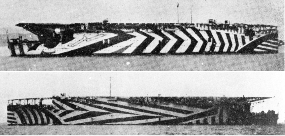
Argus Port and Starboard
I am guilty of that with this book, too. With sailing ships, the masts, spars, and sails fill up the page. One side view is all you can do. Steel warships are long lean beasts. You can put in multiple views: side and overhead both.
The two profiles Tom Milner and I agreed upon illustrated World War I aircraft carriers. There were only three. One profile plate shows the evolution of HMS Furious – as it appeared in 1917, 1918, and 1928. The other one illustrated HMS Argus and HMS Vindictive in 1918.
As built, Furious had a flying-off deck, with an 18-inch gun turret aft. There was no way to land. That was unsatisfactory, so they rebuilt Furious with a landing-on deck replacing the useless gun turret. (Furious’s turrets ended up on the monitors Lord Clive and General Wolfe.) The superstructure and smokestack made actually landing more than a bit challenging, so in 1927 Furious was again rebuilt, this time as a conventional flush-deck carrier. (Except for the feature where you could launch from the front of the hanger deck as well as the flight deck.)
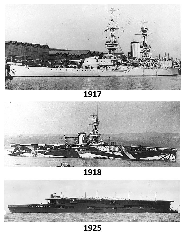
The Evolution of HMS Furious
Cool stuff, except an overhead and side view of each is six profiles. Nine if you want to show both side of each ship. Too many. A page is only so big. So Tom and I settled on just the side views. Sigh.
Same issue arose with “The Rest of the Fleet” plate. Argus and Vindictive are asymmetric. I really wanted port and starboard profile views. Tom pointed out how unamused the artist would be at all of the extra work. Also, the profiles would be so small detail would be lost. So, one side view for each. Again, sigh. (I asked about maybe doing a foldout, so it could be bigger, and Tom said something about fitting me out with a choke-chain to restrain my eagerness.)
Even given the downsizing from my overambitious expectations, these should be spectacular plates. 1918 was the golden age of the dazzle paintjob. All three ships will have the dazzle scheme used by them during the war. Each paint job is different – not just on each ship, but on each side. LSD would not be synthesized for another 20 years, but you would swear they must have had it in 1918.
Dazzle Pattern - Ooh! Pretty!
Better still, from my viewpoint, dazzle camouflage was not made up of just white, black, and shades of grey. Blue, yellow, tan, sometimes mixed together, were also included. Tracking down the dazzle patterns use and the colors of the patterns for the three aircraft carriers was one of the fun challenges in creating the instructions for these plates.
| Previous: Plates | Next: Cuxhaven |
Comments
You must be logged in to comment on this post. Click here to log in.
Submit your comment